Unveiling Ultra Violet: A Freelance Graphic Designer and his Journey into Pantone‘s Color of the Year
A Freelance Graphic Designer – Exploring the Enigmatic Hues of Ultra Violet in Design
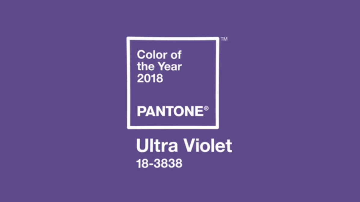
The life of a freelance graphic artist the world of design is a vast canvas painted with the diverse and vivid hues of creativity. Each color tells a story, evokes emotion, and sets the tone for visual narratives. In this kaleidoscope of possibilities, Pantone stands as a global authority, annually unveiling a color that becomes the focal point of design trends—the prestigious “Color of the Year.” In 2018, PANTONE 18-3838 Ultra Violet took center stage, captivating designers and enthusiasts alike with its provocative and thoughtful persona. As a freelance graphic designer, I embark on a journey to unravel the enigmatic layers of Ultra Violet, exploring its impact, decoding its symbolism, and tracing its fascinating evolution.
Decoding Ultra Violet: Beyond the Purple Hues
PANTONE’s Artistic Description
PANTONE introduces Ultra Violet with eloquence, describing it as a shade imbued with a “mystical or spiritual quality.” Historically linked to mindfulness practices, this color supposedly offers a refuge from the overstimulated modern world, energizing communities in meditation spaces and fostering connections. As a graphic designer, I find myself questioning the extent to which a color can embody such profound attributes. The subjective nature of color perception emphasizes the importance of considering individual perspectives.
Perspectives on Ultra Violet
While PANTONE paints a vivid picture of Ultra Violet’s qualities, as a freelance graphic designer, my personal inclination tends toward indigo blue. Yet, as a professional, I recognize that a color’s effectiveness isn’t determined by personal preferences. Instead, it hinges on its suitability for a specific project and client. This prompts the exploration of Ultra Violet’s versatility across various design projects, revealing the evolving significance of this captivating hue.
Ultra Violet Through the Ages: A Design Odyssey
Embarking on a Chromatic Time Travel
Let’s journey back through the annals of design history, unraveling the vibrant tapestry of color trends that predate Pantone’s annual declarations. Before color authorities took the stage, who decided the color of the year, and what hues graced the design palette in eras long gone?
The Age of Artisanal Pigments
Before the grand entrance of Ultra Violet in 2018, there existed an age steeped in the craftsmanship of artisanal pigments. Colors were meticulously crafted, extracted from nature’s palette, and bestowed upon the world by the skilled hands of artisans. The color of the year wasn’t proclaimed; instead, it evolved nuancedly, shaped by the natural ebb and flow of artistic expression.
When Caesar Ruled and Colors Flourished
In the year 2018, as Ultra Violet provoked thought, what hues adorned the designs of the Roman Empire? The Imperial Purple, extracted from marine mollusks, graced the garments of emperors, symbolizing power and prestige. In an era where dyes were coveted treasures, color choices were entwined with the political and social fabric.
Birth of Colors and the Nativity Palette
Fast forward to the time when Jesus was born, and we find ourselves contemplating the Nativity Palette. Gold, symbolizing kingship, adorned the gifts of the Magi. Scarlet and azure hues adorned the robes, and earthy tones embraced the stable scenes. In this epoch, color choices resonated with the sacred narratives and the essence of spiritual symbolism.
The Renaissance Palette: A Visionary Leap
A visionary leap of Ultra Violet takes a backseat to the Renaissance Palette. Michelangelo’s frescoes and da Vinci’s masterpieces bathed in a symphony of rich colors. The hues of sienna, ochre, and verdant greens unfolded a visual narrative of creativity, ushering in an era where artistic innovation dictated the color zeitgeist.
Enlightenment Hues and Mindful Tones
As Ultra Violet embraced mindfulness, we traverse back to the Enlightenment era. The mindful tones of pastel pinks, serene blues, and muted greens adorned the salons of intellectual discourse. Colors became vessels for expressing philosophical ideas and the spirit of enlightenment.
Baroque Brilliance and Colorful Connections
The Baroque era witnessed a colorful connection that transcended visual aesthetics. Extravagant golds, deep burgundies, and regal blues adorned the opulent designs of the time, fostering a sense of unity and community among artistic patrons.
The Rococo Spectrum and Unleashing Colors
Finally, let’s revel in the Rococo Spectrum. Here, vibrant pastels, ethereal lavenders, and opulent gold leafing adorned the designs. The color spectrum, unleashed in its full glory, added layers of sophistication and whimsy to artistic expressions.
Awaiting the Future Renaissance
As we anticipate the design trends of the future, we ponder the mysteries of the new color awaiting its moment. In this journey through the ages, colors have woven tales of power, spirituality, enlightenment, and unity. Before Pantone’s annual revelations, designers drew inspiration from the world around them, crafting a visual language that transcended time.
Conclusion: Navigating the Color Spectrum with Purpose
In conclusion, the exploration of Ultra Violet’s evolution over the years reveals the dynamic nature of color trends and their impact on design. As a freelance graphic designer, the key takeaway is the importance of choosing colors with purpose, considering the narrative they convey and the emotions they evoke. The color of the year, whether proclaimed by Pantone or subtly evolving through the ages, continues to shape the canvas of creative expression. As we navigate the color spectrum, let purpose be our guide, weaving narratives that resonate across time and culture.
CONTACT: A SPARK ADVERTISING & MARKETING – SAN ANTONIO, TEXAS


